Posts from September 2009.
Assignment 1
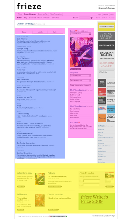
ANALYSIS OF FRIEZE MAGAZINE: http://www.frieze.com/magazine/
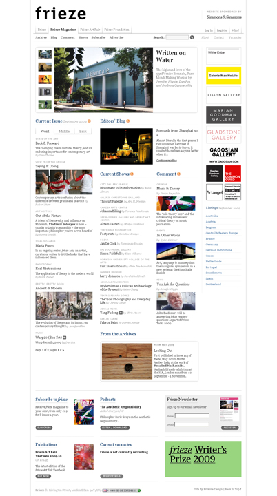
GRID:
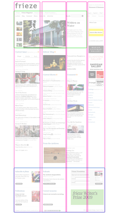
COLORS:

LAYOUT:
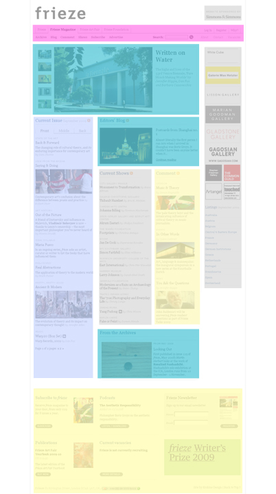
key:

TOPOGRAPHY:
The site uses 1 Font (excluding advertisement images) + slightly different font for navigation
CONSISTENCY AND USABILITY:
The site is very consistent and user-friendly. There is one central area for navigation which precisely mirrors the content present in the main page. Each navigation link goes to a secondary page. All secondary pages us the same format — a simplified and focused version of the main page. The one downside of the site is that it is very long and requires a lot of scrolling.
