Posts categorized “Uncategorized”.
Anton Stankowski
Born in Germany, 1906.
1927 studied at Folkwang Academy
1929 he began work at Max Dalang’s famous advertising studio in Zurich -> Swiss Graphic Design
His style later developed into what is now called “Constructive Graphic Art”. Emphasis on depicting processes rather then objects.
http://www.stankowski06.de/basis/englishhtml/kategorien/funktionsgrafik/funktionsgrafik.html
Influenced by artists like: Kandinsky, Modrian, Malevich – > Supermatism – emphasis on geometry.
http://www.ibiblio.org/wm/paint/auth/malevich/sup/malevich.self-2d.jpg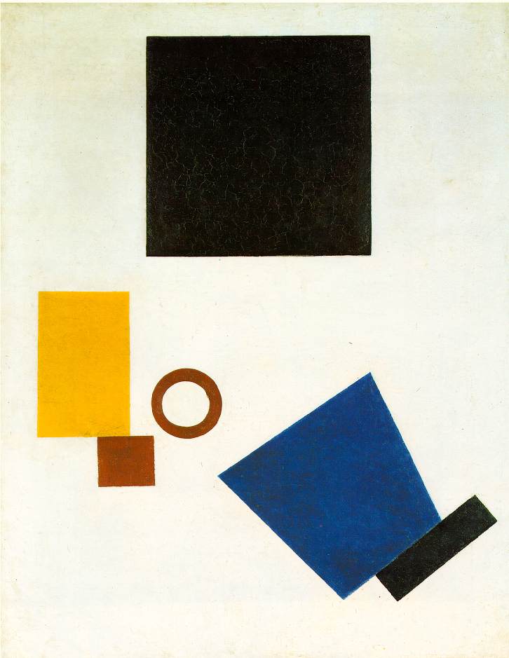
Swiss Design Style: closely related to the Contructivist Art Movement in Russia (1920). Building on the geometric abstraction of Supermatism, but rejecting its mysticism in favor of objectivity and functionality.
Swiss Style: emphasizes cleanliness, readability and objectivity.
“Swiss graphic design and “the Swiss Style” are crucial elements in the history of modernism. During the 1920s and ’30s, skills traditionally associated with Swiss industry, particularly pharmaceuticals and mechanical engineering, were matched by those of the country’s graphic designers, who produced their advertising and technical literature. These pioneering graphic artists saw design as part of industrial production and searched for anonymous, objective visual communication. They chose photographic images rather than illustration, and typefaces that were industrial-looking rather than those designed for books.”
-Richard Hollis “Swiss Graphic Desing”
Swiss Graphic Designers: Max Bill, Armin Hofmann


Assignment 1
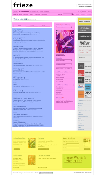
ANALYSIS OF FRIEZE MAGAZINE: http://www.frieze.com/magazine/
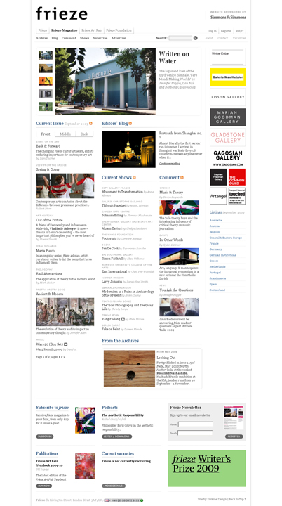
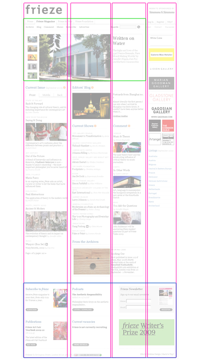
GRID:
COLORS:

LAYOUT:
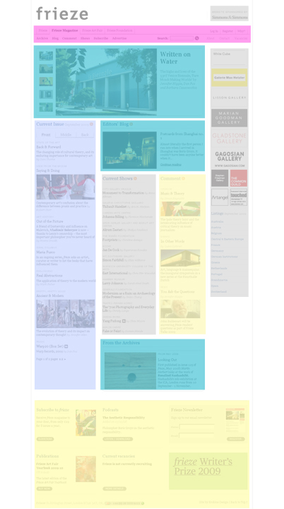
key:

TOPOGRAPHY:
The site uses 1 Font (excluding advertisement images) + slightly different font for navigation
CONSISTENCY AND USABILITY:
The site is very consistent and user-friendly. There is one central area for navigation which precisely mirrors the content present in the main page. Each navigation link goes to a secondary page. All secondary pages us the same format — a simplified and focused version of the main page. The one downside of the site is that it is very long and requires a lot of scrolling.
